Grupo Vesta
Key insight about the project goes here
Project Overview
Company: Grupo Vesta
Duration: Ongoing Monitoring
Role: UX Lead (UI Redesign & Data Visualization)
Goal: Improve the logistics monitoring interface to enhance usability, reduce cognitive load, and support faster decision-making across stakeholders.
The Challenge
The original logistics tracking system was highly functional but overwhelming for users. Despite displaying comprehensive shipment data, the interface lacked visual hierarchy, clarity, and interaction cues—making it hard for users to interpret shipment progress and delays.
Stakeholders (logistics managers, customs agents, internal operators) struggled to:
- Quickly assess cargo status
- Detect bottlenecks in customs
- Identify delays in process timelines
Research Approach
To uncover usability issues and redesign opportunities, I conducted a UX assessment using these methods:
Heuristic Evaluation
→ Assessed interface for usability, visual hierarchy, and accessibility issues.
Stakeholder Feedback Sessions
→ Collected insights from internal users and external partners on pain points with the platform.
Comparative Benchmarking
→ Analyzed modern logistics dashboards and customs tracking systems to identify UX/UI best practices.
Key Findings
- Timeline graphics were static and lacked clear progress indicators.
- Information was too dense, requiring significant mental effort to extract insights.
- Key metrics (like time in customs or selective channel delays) were buried in generic charts.
- No clear differentiation between planned vs. actual process durations.
Results
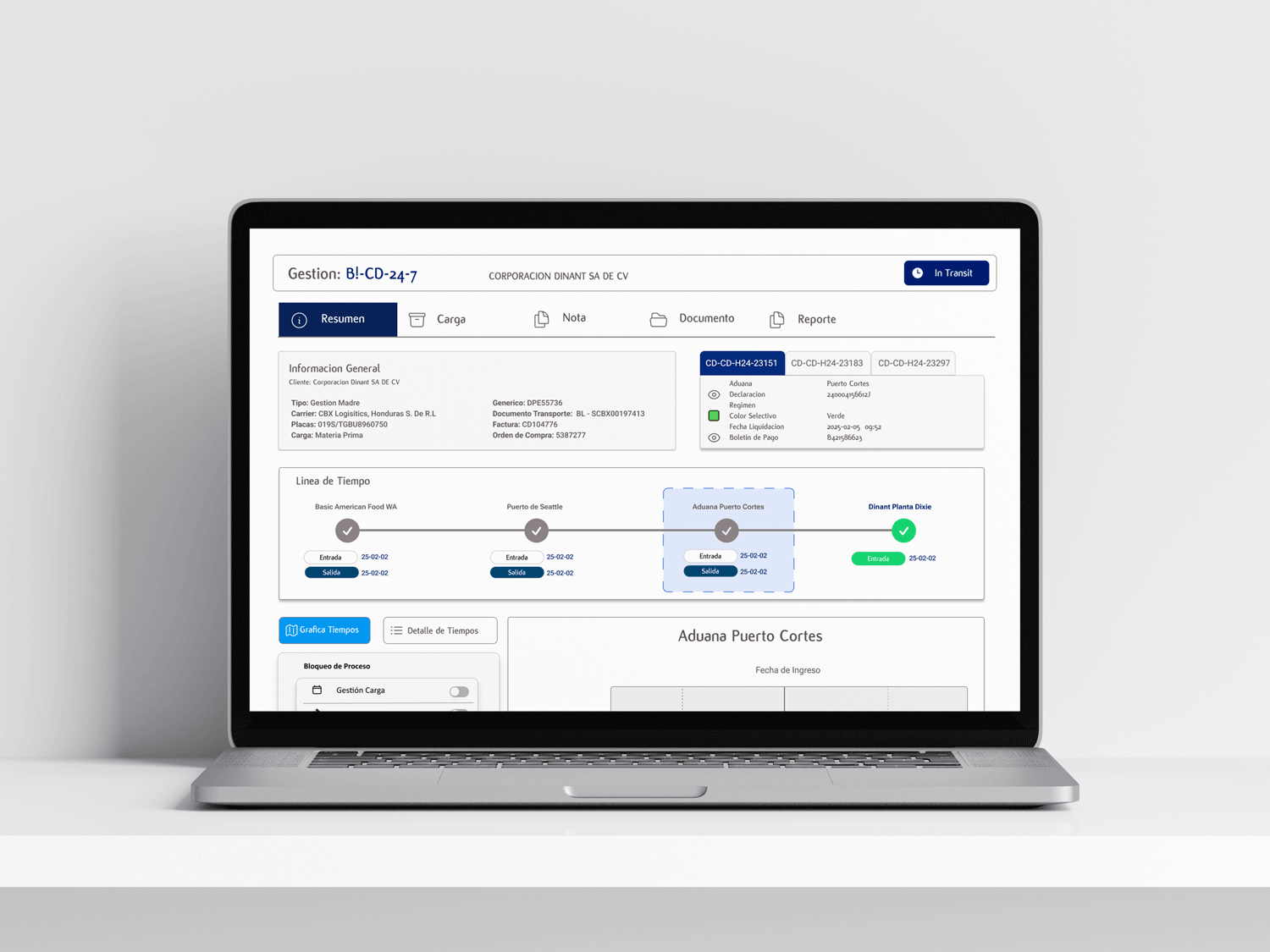
Redesigned interface with intuitive modules (Summary, Cargo, Notes, Docs).
Visual progress tracker across route checkpoints (e.g., Seattle → Puerto Cortés → Plant).
Dynamic timeline filters by process: Customs, Tax, Document Review, etc.
Integrated before-vs-after comparisons to show performance fluctuations.
Outcomes:
- Reduced user time-to-insight by 35% (internal testing with stakeholders)
- Enhanced adoption by non-technical users
- Enabled faster bottleneck detection—especially in customs processing
- Supported strategic decisions with data-driven visuals
Lessons Learned
- Visual clarity is just as important as data accuracy in enterprise dashboards.
- Redesigning around user goals (not just data fields) is key to adoption.
- Real-time logistics visibility demands dynamic filtering and simplified storytelling.
Additional Work During My Time Supporting Corporación Dinant
While working on this project, I also contributed to:
- Redesigning the customs process timeline into a comparative analytics graph
- Creating visual consistency and reusable UI components for the logistics suite
- Building an internal style guide for future UX/UI improvements

